weasyl.com · 2411912:9186029
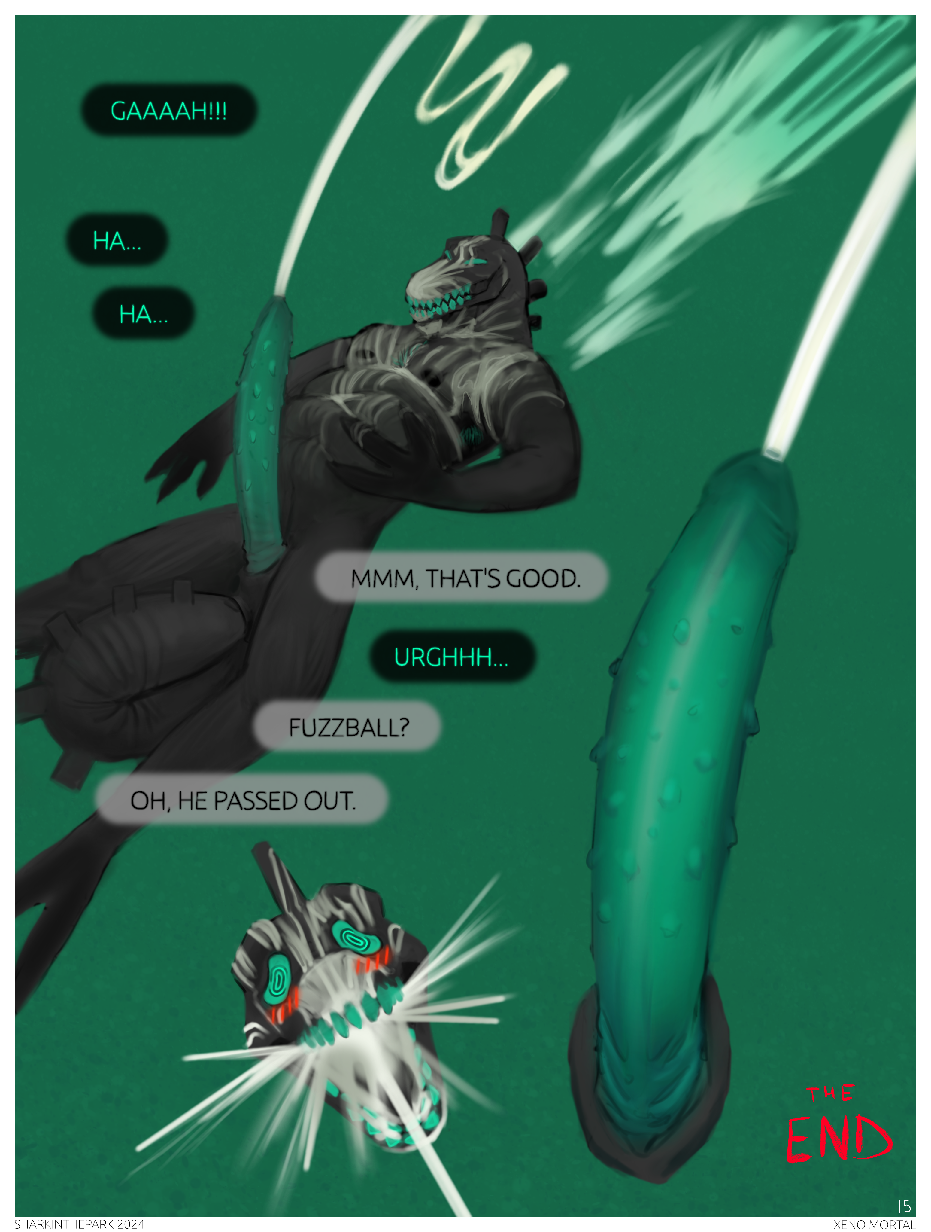
Weeeeell I ran out of steam, so it ends here :)

Project retrospective :

Inspiration

XENO MORTAL started as an idea about a cool sounding NASA space rocket. NASA has many iconic imposing names like CHALLENGER, VOYAGER and APOLLO. They sound mighty and impactful, and appropriate given the grand nature they represent. I started with a thumbnail of a terrible alien artifact, approached by an astronaut with trailing wires, with an imposing title (like CHALLENGER, but not that specific word). That thumbnail ended up being page 1 of XENO MORTAL.

The alien is supposed to be presented as a scary unkown monster that devours the protagonist. That is somewhat true, but I see it as a mostly benevolent creature that actually cares for the protag. The alien sucks up creatures over its lifespan and merges their thoughts and instincts together into one mega creature. Although it absorbs other creatures, it does not do so with evil intent. It's more of a transformation than a death.

The alien also represents a healing antidote to negative self talk. The protag expresses a lot of negative self talk (I'm stuck here forever, this is a shithole, etc.) whilst the alien counters it with more positive interpretations.

The title XENO MORTAL is a combination of xeno (alien) and mortal, which represents the fusion of the alien and the mortal protag. I was thinking of the titles of games that combine two nonsensical nouns/words together, at least to my ears, like "solid snake", "resident evil", "chrono trigger", "kingdom hearts".

Process

I started out with a small thumbnail for every page, up to about page 11, to have a roadmap of what I wanted to do. I'm not a proficient artist, so I didn't want it to have too many pages.

My paintings are usually cropped and have a stupid final size (like 1566 x 2149), but I wanted it to be more clean this time. So I made the first picture 3000x4000 with an extra 25px border of white, and used that template for each page.

I also wanted to have a striking red look, like the look of Kodak's Aerochrome film that makes trees appear red. So I got about 4 reference images that helped a tiny bit. In the end, it doesn't really look like Aerochrome, but that's ok.

And then the process for each page went like this :

Consult the thumbnail (on physical paper)

Sketch with the line tool (surprisingly effective, fun and quick)

Add solid colors in separate layers for the background and character, to avoid struggling later

Blur and merge the sketch into the character layer, to add a bit of starting contrast. Kind of like Tarran Fiddler who starts with a sketch and eventually paints into it.

Paint the background and character

Add speech bubbles

Full pages

Before XENO MORTAL, I also started another unfinished comic about the shark and red goat characters which I painted a few times recently, for which I'm currently at page 2. It's not going so well. I have trouble with the layout of the boxes and the composition. It's hard to get the spacing right to allow for the characters and text, without having huge empty spaces. There's also a bunch of backgrounds that I'm winging, with more-or-less success. So I wanted to improve the experience for XENO MORTAL, and I ended up deciding to have individual full pages, to avoid those problems altogether.

Cheating

Soooo I hold many art sentiments that are not really true, like :

There should only be one layer, like a real painting. Just pile everything in it. If you mess up, it's a matter of bad planning, not layers.

True artists don't use the line tool

Tracing is bad

Using real images in a painting is bad

Comic strips have text that looks handwritten, so you should handwrite yours too

Some of theses sound insane written out like that.

Anyway, I allowed myself to cheat for XENO MORTAL and it turned out well! In particular, I used the line tool a bunch and HOLY MOLY thank god. Making sketches was really fun, and the perspective was way easier. Drawing straight perspective lines by hand is one of the most torturous things ever.

And although I used the text tool, I still traced over it to give it a bit more character (oooh pun), but it's painful and I wouldn't do it again if I would start over.

Release

Instead of posting the pages one by one as they are finished, I decided to hold back until the whole thing was done. That let me fix a few inconsistencies between some pages and delay some decisions later (design of the monster, speech bubble colors, the footer at the bottom of the pages, etc.)

Conclusion

I am very happy with the outcome. I think the story is dramatic and interesting. Some pages are really impressive to me, and I think my art is improving slowly. My favorite pages are 3, 7, 12. Also, on page 9, the wolf in the top panel looks sexy AF. Dayum, what a hunk hahaha.
Comments
No comments yet.
Log in to comment.